Redesigning the Resource Center for Better Self-Service and Onboarding in a B2B SaaS Platform
I led the redesign of the Resource Center for a B2B SaaS product to improve user onboarding, support access, and product education.
Role
Product Designer
Company
UserGuiding
Tools
Figma
Miro
Year
2024
Website
panel.userguiding.com
Project Overview
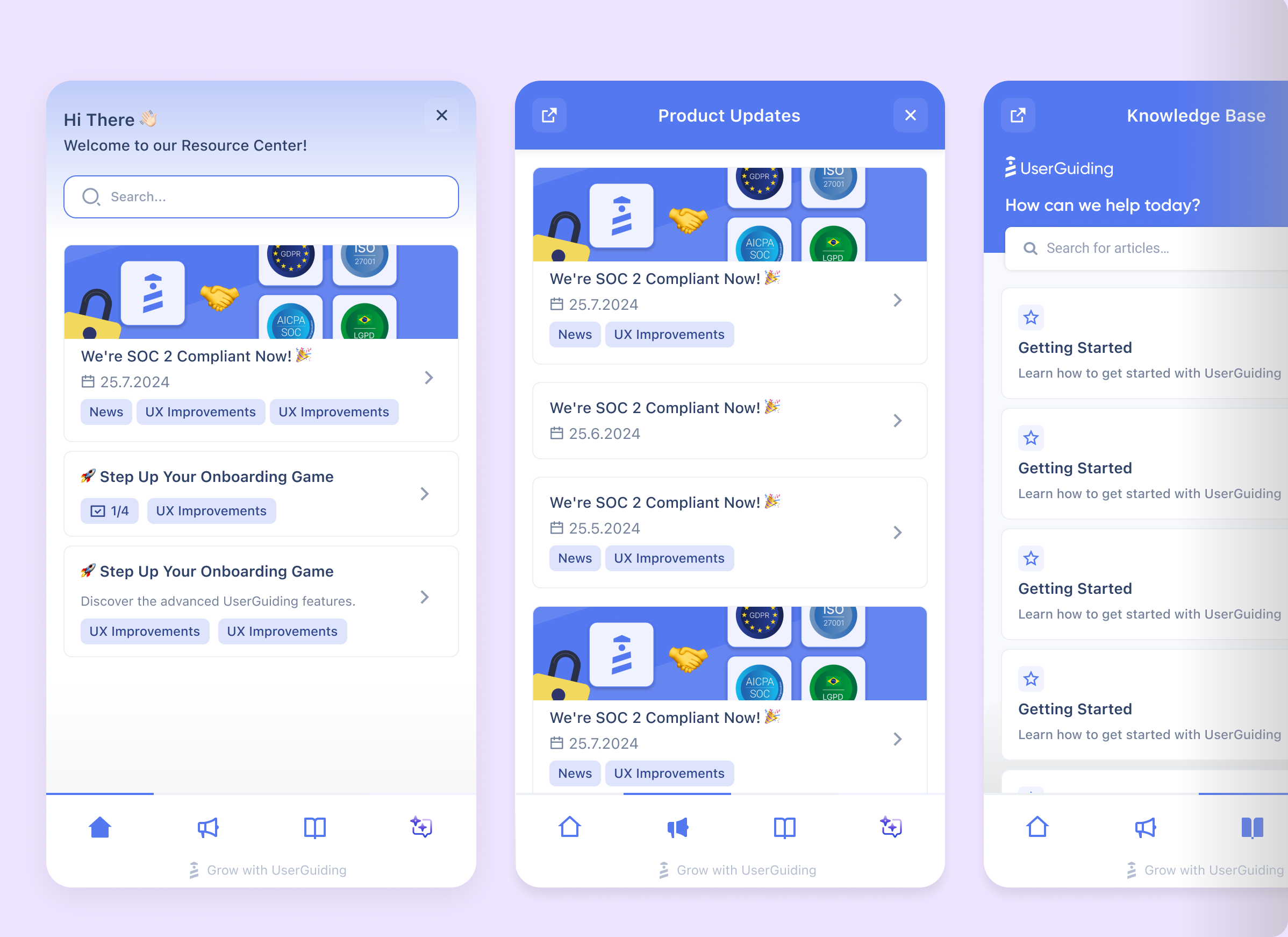
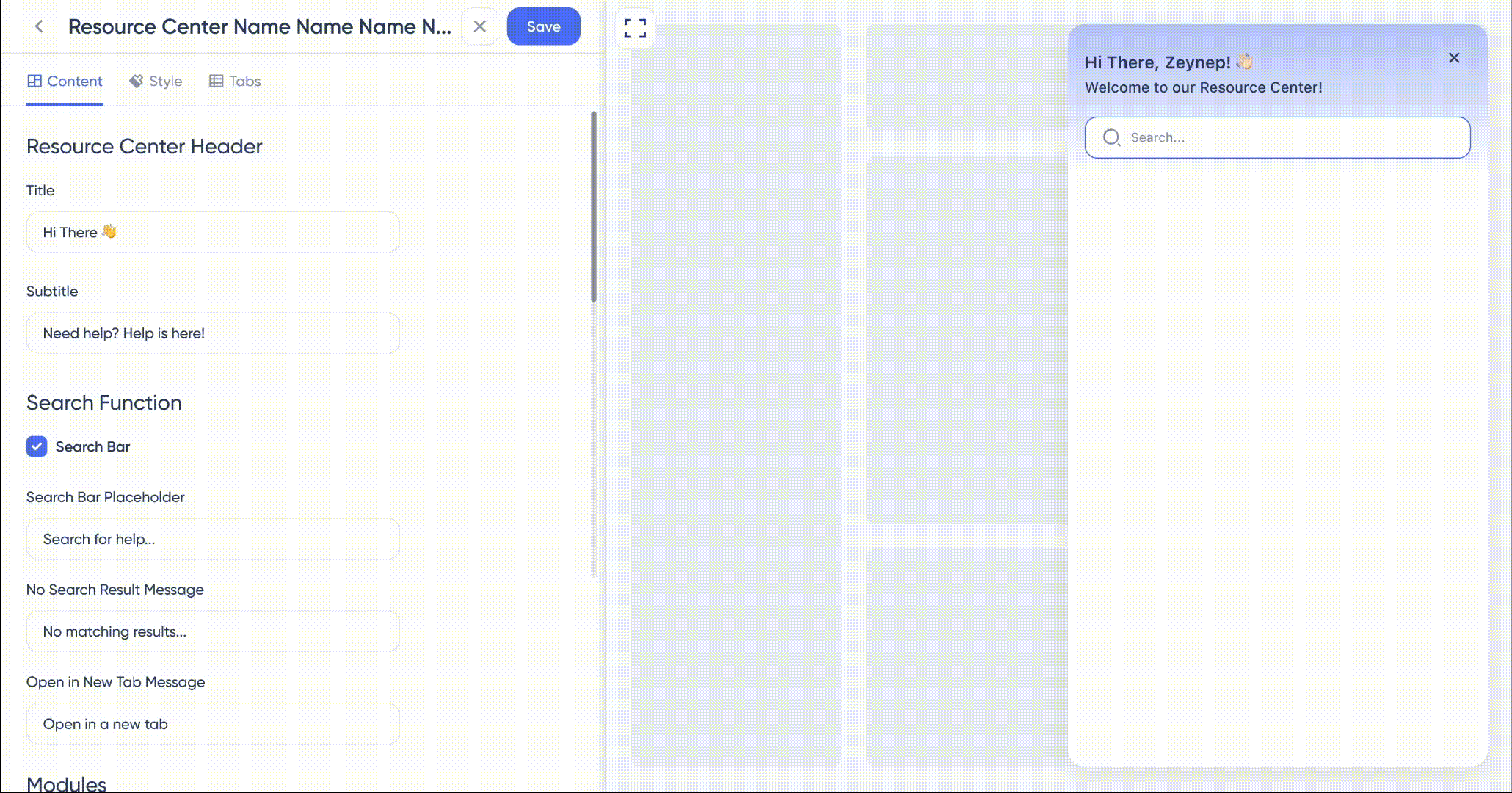
I led the redesign of the Resource Center at UserGuiding, a no-code user onboarding platform that helps SaaS teams create interactive guides and tooltips. The goal was to improve onboarding, support access, and product education by making help content easier to find and more relevant to user context.
As a tool focused on onboarding, UserGuiding needed its own support experience to be seamless. However, the existing Resource Center was hard to navigate, disconnected from the product, and not aligned with user goals. This led to increased support tickets and lower adoption during onboarding.
Problem Statement
How might we create a more intuitive and context-aware Resource Center that helps users quickly find relevant support content during onboarding and product adoption, reducing frustration and support tickets while accelerating their time to value?


Research

Methods
Key Findings:
62% of new users did not interact with the existing Resource Center during their first week
Over 40% of support tickets were related to content already available in the documentation
3 out of 5 users said they "didn't know where to look for help"
Users preferred searching by goals (e.g., "set up onboarding flow") instead of feature names
Help content lacked contextual visibility inside the product and was only accessible via a separate tab
Information Architecture
We prioritized features through clustering exercises and mapped them based on user needs. This helped define a clear structure, surface key actions, and ensure easy access to the most used content and tools.

Scope and new
We aligned on the scope and direction to focus on high-impact features, reduce complexity, and keep the roadmap user-centered.
Design Audit
Conducting a design audit after thorough research is crucial, as it leverages valuable insights to clearly identify weaknesses and areas for improvement. This ensures that design decisions are data-driven and effectively address user needs.


Component Library & Design System
r I designed utilizes a comprehensive design system and component library featuring trendy UI elements to ensure consistency and scalability. This approach creates a modern, user-friendly interface that enhances usability while maintaining a cohesive and visually appealing experience.


All Designs